Key Takeaways
- Strong advisor websites establish trust, credibility, and professionalism within seconds through design and strategic content.
- Blending intuitive usability, educational content, and visible compliance practices creates a more trustworthy digital presence for financial advisors.
Did you know most financial prospects form an opinion about your brand within seconds of landing on your website? Explore how leading advisors design digital experiences that build instant trust and engagement. This guide brings you practical examples and actionable advice to help you level up your own site in 2026.
Why Do Advisor Websites Matter?
First impressions and credibility
Your website is often a client’s first in-depth interaction with your brand. In a highly regulated and trust-driven profession, first impressions matter. A polished, user-friendly website signals professionalism and shows visitors you value transparency and attention to detail—qualities clients are seeking when entrusting you with their finances.
Supporting client trust
Beyond the first three to five seconds, your website becomes a foundation for ongoing trust. Clear explanations, secure features, and consistent visual branding build confidence. Trust isn’t established once; it’s reaffirmed through every page, headline, and resource your website offers.
What Makes an Effective Advisor Website?
Key elements of usability
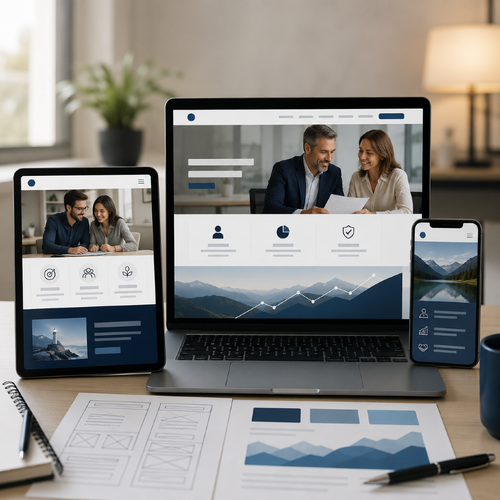
Usability sits at the heart of a successful advisor website. Your site should be easy to navigate, accessible on all devices, and quick to load. Logical menus, clear calls-to-action, and well-organized content help prospective and current clients find information efficiently, improving their overall experience.
Compliance considerations
As an advisor, staying compliant online is non-negotiable. Every element, from content to design, needs to align with industry regulations. This includes displaying proper disclaimers, protecting client data, and refraining from promissory or exaggerated claims. Advisors who proactively manage compliance can build both regulatory confidence and client peace of mind.
11 Financial Advisor Website Examples
Example 1: Clean navigation and calls-to-action
Great advisor websites prioritize intuitive journeys. Simple, uncluttered menus paired with clear buttons—like “Schedule a Consultation” or “Learn More”—help turn visitors into engaged prospects without overwhelming them.
Example 2: Educational resources and blog integration
Featuring blog articles, educational videos, or downloadable guides transforms your site into a hub for learning. This not only nurtures your existing clients but also attracts prospects who value financial literacy.
Example 3: Clear value proposition messaging
A focused headline such as “Guiding Your Retirement Journey” immediately communicates whom you serve and your approach. Websites that state their value upfront reduce confusion and help prospects self-qualify quickly.
Example 4: Consistent branding and imagery
Professional photography, tailored color schemes, and thoughtfully selected icons signal attention to detail. Strong, consistent branding distinguishes your firm and makes your site memorable among competitors.
Example 5: Strong mobile responsiveness
With more clients searching on their phones or tablets, responsive design is essential. Sites that format seamlessly to smaller screens enhance user experience and prevent lost opportunities due to technical frustrations.
Example 6: Trust-building with testimonials
Well-placed testimonials and credentials (appropriately disclosed and compliant) establish social proof. When prospects see authentic feedback, they’re more likely to trust your expertise.
Example 7: Secure client portal access
Client portals offer encrypted communication, secure document uploads, and streamlined collaboration. Highlighting portal access on your site reassures clients that their sensitive data will be handled properly.
Example 8: Accessible contact and scheduling features
Including easy-to-find contact forms, click-to-call buttons, and online appointment scheduling tools lowers the barrier for prospects to reach out. This user-centric approach makes your services more approachable.
Example 9: Visual storytelling techniques
Websites that use explainer videos, infographics, or custom illustrations make financial topics more approachable and engaging. Visual elements help explain complex ideas and humanize your brand.
Example 10: Structured service descriptions
Breaking down your services into clear, jargon-free descriptions empowers visitors to understand exactly what you offer. Bullet points, short paragraphs, and supporting visuals enhance comprehension.
Example 11: Prominent regulatory disclosures
Placing regulatory disclosures in visible locations—such as page footers or dedicated legal pages—reflects your commitment to compliance and client transparency. This best practice supports both legal requirements and credibility.
What Content Builds Credibility Online?
Thought leadership through articles
Publishing thought pieces, market updates, or commentary on current financial trends positions you as an authority. Demonstrating your knowledge in writing helps prospects and clients see your depth of expertise and your commitment to educational value.
Explaining key financial concepts
Not everyone visiting your site has the same level of financial literacy. Explaining foundational ideas, breaking down jargon, and answering common questions builds accessibility. This signals your willingness to educate and empower visitors, further strengthening trust.
How Can Advisors Improve Website Usability?
Navigation simplicity
Streamlined navigation helps clients and prospects feel more comfortable engaging with your services. Limit your menu to essential pages—such as Home, About, Services, Resources, and Contact—to avoid decision fatigue and guide visitors where they need to go.
Conversion-focused layout tips
Use white space, contrasting buttons, and clear section dividers to lead visitors’ eyes. Place calls-to-action where they naturally fit, like after service descriptions or within sidebar widgets. These subtle design tweaks often yield higher engagement without overwhelming visitors.
FAQ: Advisor Website Best Practices
How often should websites be updated?
To stay relevant and secure, review and refresh your content, design, and technical features at least annually. Add new articles, testimonials, and regulatory updates as changes occur, ensuring your site always reflects your current practice and industry standards.
What are common compliance missteps?
Common challenges include missing disclosures, using promissory statements, displaying outdated content, or lacking security for client communications. Regular compliance reviews with your team and, if necessary, legal counsel can help minimize risk and keep your web presence strong.