Key Takeaways
- Effective website design directly impacts how clients perceive your credibility and trustworthiness.
- Strategic UX improvements help financial advisors convert site visitors into engaged prospects.
First impressions matter, especially online. For financial advisors, your website is a digital handshake—a vital first touchpoint that shapes credibility and trust. Explore how a thoughtful website redesign elevated both the credibility and user experience (UX) for advisors, offering insights you can apply to your own online strategy.
What Was the Project Scope?
Goals for website redesign
Financial advisors increasingly recognize that an outdated or difficult-to-navigate website can hinder business growth. The core goal of this case study’s redesign was to build instant credibility with prospective clients by modernizing the look and feel, strengthening trust signals, and streamlining content. Advisors aimed to guide visitors naturally from information discovery to engagement while demystifying complex services.
The design process prioritized clear communication, visual professionalism, and a cohesive brand identity. Essential objectives included:
- Creating a straightforward and inviting user journey
- Making information about services, credentials, and values easily accessible
- Ensuring that prospects felt reassured and informed at every click
Target audience considerations
The primary audience was individuals and families seeking trustworthy financial guidance, often with varying levels of financial literacy. Advisors also served business owners looking for specialized expertise. As such, the redesign had to serve diverse age groups and backgrounds while remaining clear and accessible. Special attention was given to:
- Readable typography and high-contrast color schemes
- Intuitive navigation for users of all tech comfort levels
- Visual elements that reflected professionalism without intimidating new visitors
How Does Website Design Impact Credibility?
Trust signals and professional visuals
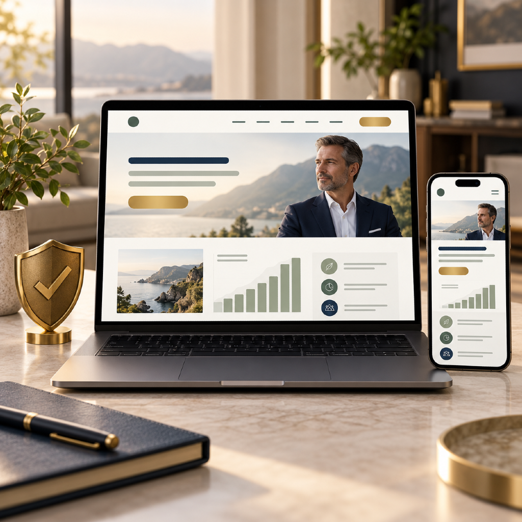
Credibility is not just earned—it’s communicated through your site’s design. Elements such as a professional logo, consistent color palette, and high-quality imagery play a significant role. The case study highlighted how integrating photos of real advisors, clear contact information, and credentials (such as industry affiliations) can ease site visitors’ skepticism.
Other trust-enhancing signals included:
- Secure connection indicators (HTTPS)
- Straightforward language and transparent explanations
- Easy-to-find disclosure and compliance statements
- Mobile optimization and up-to-date design patterns
Common credibility pitfalls to avoid
Several frequent website design missteps can undermine credibility, even if your team has years of expertise. Advisors learned to avoid:
- Outdated website templates or broken links
- Overuse of stock images that feel generic
- Inconsistent branding or messaging across pages
- Missing or hard-to-find contact details
Financial professionals should regularly review their website to address these credibility risks and avoid inadvertently turning away potential clients due to trust concerns.
What UX Challenges Did Advisors Face?
Key pain points identified
Initially, the advisor’s website presented multiple obstacles for both new and returning visitors. Pain points included cluttered menus, confusing service descriptions, and inconsistent page layouts. Site analytics also revealed high drop-off rates on core pages, suggesting a disconnect between how the content was presented and what users expected.
Clients struggled to find answers quickly, often abandoned inquiry forms, and hesitated to proceed without a clear explanation of the value. This underscored the importance of a user-centric approach for financial advisor websites.
User behavior analysis findings
Behavioral analysis provided actionable insights. Heatmaps and user recordings showed visitors hesitated on pages that required registration or used technical jargon. Navigation confusion and mobile display inconsistencies contributed to friction.
Key findings showed:
- Prospects lingered longer on pages featuring authentic advisor bios and client education materials
- Call-to-action buttons buried deep within pages saw lower engagement
- Many users accessed the site via smartphones, but mobile layouts didn’t always support an optimal experience
Strategies Used to Enhance User Experience
Navigation and accessibility improvements
The redesign streamlined navigation with simplified main menus and clear pathways to high-priority content such as services, credentials, and resources. Intuitive navigation bars, accessible dropdowns, and logical page groupings helped visitors explore the site with confidence.
To improve accessibility, the team implemented best practices such as proper heading hierarchies, alt text for images, and screen reader compatibility. These improvements not only broadened the advisor’s reach but also supported inclusivity for users with disabilities.
Mobile-friendly considerations
Acknowledging the shift toward mobile browsing, the site’s redesign adopted a fully responsive framework. Layouts, buttons, and forms adjusted seamlessly across devices. Fast load times and touch-friendly interfaces became priorities, reducing the friction facing prospective clients during their research phase.
Testing across multiple devices and browsers ensured all visitors—desktop, tablet, or phone—received a consistent, positive impression of the advisor’s professionalism.
How Did Advisors Build Client Trust Online?
Transparency features and clear content
Trust is fostered through straightforward content and transparent practices. Advisors used readable, jargon-free explanations of complex topics, making services approachable for clients at any level of financial knowledge. Key transparency features included:
- Upfront “About” sections outlining qualifications, process, and philosophy
- Visible disclosures, privacy statements, and clear navigation to regulatory information
- Clearly stated fees or cost structures, where appropriate, to eliminate guesswork
Social proof and educational resources
Client testimonials, peer endorsements, and curated educational content build trust. By weaving in authentic stories (where allowed) and robust FAQ sections, the website positioned the advisors as accessible experts. Downloadable guides, blogs, and video explainers further empowered visitors to continue their financial education and reinforced the advisors’ reputability.
Lessons Learned from This Case Study
Process takeaways for financial professionals
A strategic redesign is more than a visual facelift—it’s an ongoing effort involving feedback, analytics, and adaptation. Advisors found that ongoing client feedback, paired with routine usability tests, led to measurable improvements in engagement.
Continuous content updates kept the site relevant and trustworthy. The process also highlighted the value of cross-functional collaboration—marketing, compliance, and client service all played crucial roles in achieving lasting results.
Replicable strategies for other firms
Other financial professionals can adopt several proven tactics from this case:
- Prioritize clear, easy-to-understand language and visual hierarchy
- Involve compliance early in the copywriting and approval process
- Regularly evaluate site analytics to guide content and design updates
- Use real photos and team bios to humanize your brand
What Can Financial Advisors Apply in 2026?
Actionable steps for modern website design
Looking ahead, your digital presence should evolve with client expectations. For 2026 and beyond, consider implementing the following steps:
- Keep core information—services, credentials, contact details—front and center
- Make use of interactive tools like scheduling widgets or dynamic FAQ pages
- Invest in ongoing content creation that educates and empowers
- Regularly conduct accessibility audits and mobile optimization reviews
Staying current with digital best practices
The digital landscape changes quickly. To remain credible, advisors should:
- Stay updated on regulatory requirements affecting presentation and content
- Review competitors’ digital experiences to identify opportunities for differentiation
- Embrace transparent communication and showcase ongoing education efforts
- Engage with clients through value-driven resources and regular updates
In summary, modern website design for financial advisors is a multifaceted endeavor that directly impacts client trust and experience. By prioritizing credibility, transparency, and user-centered design, your firm can meet the needs of today’s and tomorrow’s clients.